
How to Make an Indie Sleaze Music Video With AI

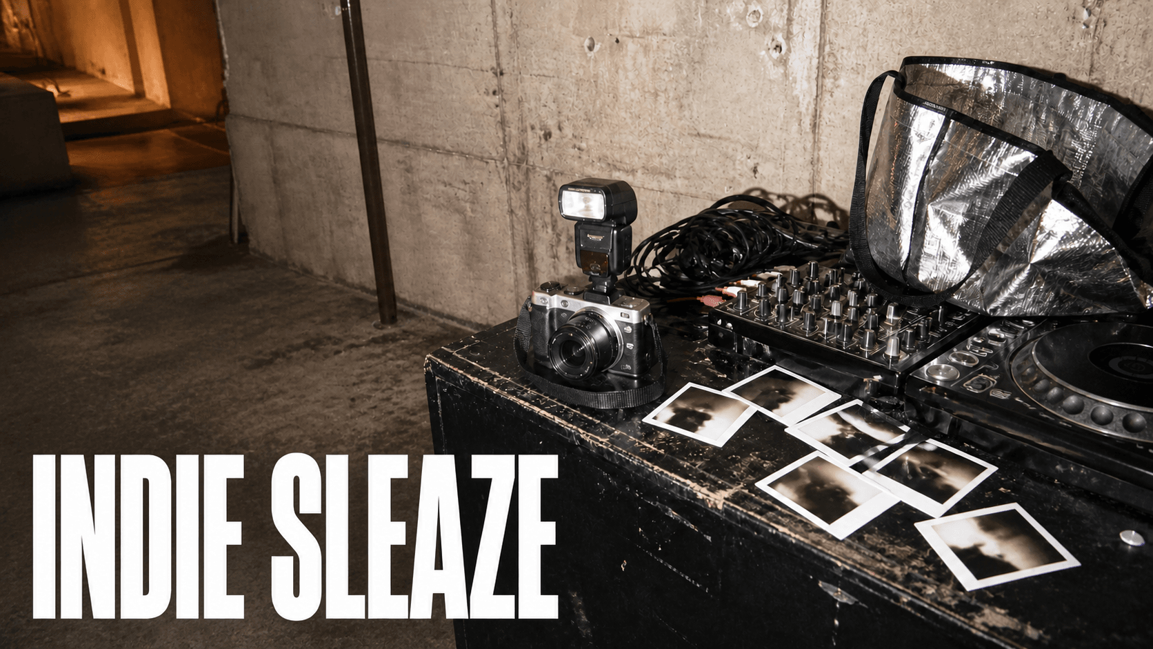
Indie sleaze is a late-2000s party-documentary look: direct on-camera flash, handheld drift, high-ISO noise, and a crowded room that was never lit for filming. You build it by prompting how the camera behaved, not by adding damage to the picture. That distinction is the whole page.
The year bands and the shared style blocks live on the 2000s look recipe. This page is the late-2000s lane, and it is deliberately not Y2K proper.
What You Need
- A room anchor — one image of a crowded venue, not a portrait.
- A second vantage in that same room.
- A track, and an editor for the final grade.
- A willingness to frame badly. This is the hard part.
What Indie Sleaze Actually Was, And What People Still Argue About
Worth knowing before you prompt, because the disagreement is the useful part.
GQ calls it "more than a trend, less than a movement, certainly a vibe" — and notes that nobody used the label at the time, which is why it retroactively collapses several distinct scenes into one name. Vogue's writers debated the revival and landed on "the lack of sleaze": the original's sloppiness sits badly with a culture of stylists and curated images.
The communities are blunter. The top comment on one long thread asks straight out, "Is 'indie sleaze' real? I thought it was Gen Z's imagined version of the 2000s." Another, from someone who was there: "It's like they picked a bunch of random people that loosely fit an aesthetic and said it was a movement."
A creator video walking through the discourse lands on the point that matters most for prompting. The original era "was based on photography of real people just going to parties in their unique outfits in their own personal styles. So it's an amalgamation of a bunch of different people's unique personal styles." And crucially: "the aesthetic wasn't made for social media like how a lot of aesthetics are made nowadays."
The same video flags a difference between then and now that changes your palette. The original had bright neon accents. The current revival "seems a lot more grungy and darker neutral colors … but it doesn't seem as colorful as the OG." Decide which one you are making.
One open question this page does not settle. Some treat indie sleaze as a sub-aesthetic inside a broad Y2K umbrella. Others treat it as a later rebellion against the polished McBling look.
Both readings are live, and sources also disagree on whether the revival is current or already over.
Flash, Not Filter: The One Thing to Get Right
The naive prompt is grainy VHS party video, heavy glitch, scanlines. It is wrong twice.
First, the damage is the wrong mechanism. A generated artifact attaches to the subject and deforms with it. A post layer attaches to the frame and stays put. Both DomoAI style kits put heavy VHS glitch and excessive scanlines in the negative prompt for that reason.
Prompt the capture behaviour. Put the damage in post, if it belongs anywhere.
Be honest that this is a mechanism and not a settled result. Other creators report gains from prompting bounded defects like slight compression artifacts or mild interlacing grain. No controlled test decides it. The working rule is bounded capture defects in the prompt, unbounded damage in post.
Second, and more important: the aesthetic is not a texture at all. It is a social situation. GQ's material signs are flash photography, wild club nights, early-web technology, trucker hats, domestic beer cans and DIY consumption. A well-lit single subject with grain on top is not indie sleaze. A crowded room badly lit by an on-camera flash is.
There is a natural experiment that proves it without any theory. Someone bought a 2006 point-and-shoot with the previous owner's photos still on the card. The top comment, at 536 points, identifies the real signifier, and it is behavioural: "fun party scenes, candid shots, goofy poses, lived-in rooms. Now you see a lot more very posed and curated photos … the background is a perfectly clean room looking like a museum."
Clutter and candour read as 2000s. Clean and posed read as now, whatever grade sits on top.
Build the Room, Not the Portrait
Your anchor image is a scene with people in it. Not a hero shot of one person you will later surround.
Generate it in Midjourney. Let the flash blow out whoever is nearest. Let someone be clipped by the frame edge.
Midjourney — room anchor

a crowded basement party in a low-ceilinged room, six or seven original fictional
people in their twenties mid-conversation, direct undiffused on-camera flash from
the photographer's position, nearest person's shoulder and cheek blown to white,
background falling to crushed near-black two metres behind, unbranded drink cans
on a cluttered side table, coats piled on a chair, snapshot framing with one
figure clipped by the right frame edge, high-ISO noise in the shadows, soft focus
at the edges, late-2000s party documentary photograph
--ar 9:16 --raw --s 55 --no studio lighting, glossy fashion editorial, clean empty
background, brand logos, readable trademark packaging, celebrity, text, watermark
Keep the Variants Badly Lit
Take that anchor into GPT Image 2 for a second vantage in the same room. The instinct will be to clean it up. Resist it.
GPT Image 2 — second vantage, generated from the anchor

Use the supplied photograph as the exact reference for the room, the people and
the lighting behaviour. Create a second vertical frame from a different position
in the same basement party, roughly ninety degrees around. Preserve the same
people, the same clothing, the same clutter and the same direct on-camera flash
behaviour: nearest subject blown out, background crushed to near-black, high-ISO
noise in the shadows. Keep the framing candid and slightly off — do not centre
the subject. Do not clean up the exposure, do not even out the lighting, do not
tidy the room. No text, logos, brand names or watermarks. Portrait orientation,
9:16.
Prompt the Camera's Behaviour
This is the vocabulary that does the work. Use it in the video prompt.
Direct undiffused on-camera flash with hard falloff. Blown near-subject highlights. Crushed background. High-ISO noise in the shadows. Handheld drift, not stabilisation. Snapshot framing. Subject off-centre or clipped by the frame edge.
Adorama's account of the digicam revival lists the same cluster: soft focus, close undiffused flash, grain, warm shifts, clipped highlights and shadows, blooming speculars, candid composition.
It also cautions that naming the sensor is not the look. The behaviour is the look.
One action and one camera move per generation, five to seven seconds each.
Seedance 2.5 — Omni Reference — party beat

Image 1 controls the basement room, the people, the camera position, the flash
direction and the composition, and is the literal first frame.

Create a 6-second vertical 9:16 handheld shot. The camera moves one step into the
room past the nearest figure's shoulder while the person at centre-left turns
toward the lens and laughs mid-sentence. Direct on-camera flash fires from the
camera position throughout: the nearest shoulder and cheek stay blown to white,
the far wall stays crushed to near-black, and specular highlights bloom on the
drink cans. Handheld drift and a small stumble in the move, no stabilisation.
High-ISO noise sits in the shadows. Motion blur on the turning head.

Everyone in frame wears their reference clothing for the full six seconds. Bare
wrists. No readable text, logos, signage or subtitles.
And the negative block, taken from the style kits' actual global negatives:
heavy VHS glitch, excessive scanlines, tracking error, date stamp, HDR,
teal and orange grading, perfect gimbal stabilization, hyper-sharp 8K,
glossy studio advertisement, evenly lit interior, clean empty background,
brand logos, copyrighted characters, readable trademark packaging,
random text, watermark
Add the Damage Last, If At All
Grain, compression and any tape treatment go on as one global layer over the finished cut, never per clip.
Reported practice sits around 15% grain intensity — enough to see texture, not enough to look like a VHS tape. Titles, artist name and your end card all go on in post.
What to Check in a Good Output
The flash test. Is the nearest person blown out and the background crushed? If everything is evenly lit, the flash never happened and no grade will add it.
The room test. Is there a party, or is there one person against a background? A single subject with grain is a fashion film, which is exactly the critique the aesthetic keeps attracting.
The damage test. Freeze on any artifact and track it. Does it move with a body, or sit still on the frame? If it moves with a body, it came from the prompt and belongs in post.
Tips
- Cast for a room. Six people badly lit beats one person well lit, every time.
- Frame badly on purpose. Let someone be cut off by the edge. Centre nothing.
- Do not over-prompt. Crowded prompts collapse toward the average — one tester's verdict on another model was that the more you add, the more it drifts toward generic. One action, one camera move.
- Keep the negative list to the kits' entries. A longer list dilutes the positive instruction.
- Clutter the room. Coats on chairs, cans on tables, things on the floor. Clean rooms read as now.
- Keep the same faces across shots if the piece follows anyone — the mechanism is in keeping the same faces across shots.
Frequently Asked Questions
What is the indie sleaze aesthetic?
A late-2000s party-photography look built on direct on-camera flash, crowded venues, DIY styling and candid framing. The label was applied retroactively, and what it covers is genuinely disputed.
Is indie sleaze the same as Y2K?
Not the same, and sources disagree on the relationship. Some treat it as part of a broad Y2K umbrella; others treat it as a later rebellion against the polished McBling look. Pick your year band and say which.
Should I add grain and VHS effects in the prompt or in editing?
Bounded capture defects like restrained grain can go in the prompt. Unbounded damage like glitch and tracking error belongs in a post layer. A generated artifact deforms with the subject; a post layer stays on the frame.
Why does my indie sleaze video look like a clean fashion video?
Because your reference is a styled portrait. The aesthetic is a social situation, not a texture. Put several people in a room and let the flash ruin the nearest one.
What camera look should I describe for an indie sleaze video?
Direct undiffused on-camera flash with hard falloff, blown near-subject highlights, crushed background, high-ISO shadow noise, handheld drift and snapshot framing. Describe behaviour, not equipment.
How This Compares to One-Click Retro Filters
A retro filter applies the same damage uniformly to whatever you give it. If the underlying footage is a clean, evenly lit portrait, you get a clean portrait with damage on it.
That is the failure this whole page is about, sold as a feature.
Building the exposure behaviour into the generation costs more thought. It also gets you the one thing a filter cannot add afterwards: a room that was never lit properly in the first place.
For other stylised looks that work the same way, see trippy and stylised AI video. For music-video formats generally, start at the AI Music Video Generator hub.
Open DomoAI Omni Reference and build the room first.